I have used the August sketch from Get Creative and just for fun thought I'd show you the same LO with two different background papers.
I think I prefer this version, more masculine -
But I quite like the fresher feel of this one - Notice they are still both wooden papers, with chevrons, still loving that look! Let me know which you prefer - very interested...
And then our girl had her year 10 semiformal on Saturday night. Huge event, all day spent preparing for it - and she looked beautiful. Meaghan had gone to a friends house for makeup and to get dressed. Geoff and I turned up for the red carpet arrivals and we didn't recognise her at first - so grown up. We just about burst with pride. Here she is with her date - Lachy who came back from Newcastle for the weekend.
With her three best friends -

And here she is with her group of friends in a more informal pose -
And of course I had to do a Lo for her, this was for a challenge at the Lilypad, which was to use a royal name (queen, prince , princess etc). As my Dad had already said she looked like a princess, I had a ready made quote (although I will keep this one from Meaghan for a while as she is 15 and horrified at being called a princess..

Have yet to see the official photos yet - ours were pretty ordinary as it was pitch black and freezing cold - a function in Canberra in August- not the best timing - luckily they are young and can cope with sub zero temps in strapless dresses...
Off to sign the lease now and then more serious packing (most of my scrapping stuff is already packed. Have kept three pizza boxes worth out but the rest will go into storage. Some big descions need to be made about whether I continue paper scrapping next year or not. Either way I won't be getting any new supplies in the meantime.
Ok, have a good day. xx


12 comments:
Ohhhhhh so much coolness in one post!!!! Princess dresses, red carpets, cool room!!!! And I think I like the wood background the best!!!!!!
Beautiful layouts, beautiful photos ... I prefer the first background as well, gives it more character ... thanks for joining us at Get Creative!
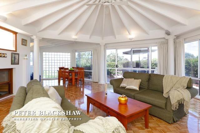
Where to start...at the end...you can make your own decision about keeping scrapping or not, but I absolutely REFUSE to let you stop blogging! You're posts are such FUN:)) Your princess is a real sweety - they look so fresh & young & enthusiastic...it's lovely:):) Your lounge room looks the same -wow! Enjoy this space...I would! Looks like a good suncatcher, too - always a bonus in Canberra:):)
And I like LO #2 - whiter bg. I think it makes the photo pop & draws my eye to it...
Happy packing:):)
Please don't stop scrapping when I have only just found you! I too am struggling with time and inspiration...BUT we musn't gibe up!
I hope you don't stop scrapping!! I always loveeeee your lo's!! Happy Birthday to Matt and loving the formal photos!!!! CONGRATS on the house!!!
Gorgeous layouts, love them all! With woodgrain vs white, mm tough..I would say the woodgrain or the white but with a bit more red underneath to make it pop! That room in your house looks phenomenal, scrap room maybe? lol Thanks so much for your kind words on by blog too =)
Oh wow what can I say I LOOOOOVE the new rental woohoo can I comw and stay with you...I apologise for my absence but I will not be able to write to you till the begining of September as we leave on Tuesday for a 2 week vacation! things have been hectic here you will here all about it!
adore the layouts i cannot choose between the 2! LOL love both background papers!
Thank you for your continued support of Get Creative
huge hugz
irini
amazing work!!!thank you for joining us at gc!!
Karen,both layouts are really amazing.But my favourite is the first one.I like the contrast more.
Thank you for playing with us at GC.
Hi Keren! Your new rental is so cool!!!!! Enjoy it!!!! Your layouts are all adorable! I really love your work!!! Wonderful photos!!! Thank you so much for playing along with us at Get Creative!
Hi Karen, I will go with the second one! I love the white background, it adds light to your photo!!! Wonderful take on the sketch! Thank you so much for supporting GC and sharing your beautiful pages with us!
stunning work!!! love the details!
Post a Comment